Contents tagged with UIUX
-
Confirmations in User Interfaces: Explicit vs. Implicit
Confirmations are a tricky subject in user interface design. As a UI designer, you want to avoid them, but you cannot always implement an undo/redo system. As users, we do not want to be nagged constantly, but if an action has serious consequences and something goes wrong, we angrily ask why there was no confirmation.
In addition to interrupting the flow of our work, confirmations can also introduce a tiny bit of stress. Confirming too fast and losing work is not fun. Even if the action was not permanent and, e.g., files can be brought back from the recycle bin, there is some kind of hassle involved. So, you do want to be sure about what you confirm.
In theory, when you directly look at something and trigger an action, a generic question like “Do you want to do this?” should be sufficient. The context of your action determines what “this” means (I cannot help myself thinking of an old JavaScript joke, but I digress).
In practice though, in a world full of distractions, sometimes when you see a dialog like this…
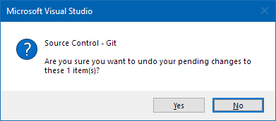
…, you may notice that your eye wanders back to the selection of the “item”.
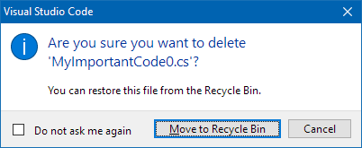
This is why a dialog that explicitly tells you the name is a better solution:
But what about deleting multiple files? Depending on how large the number is, a dialog cannot show all names. The following dialog stops at ten files:
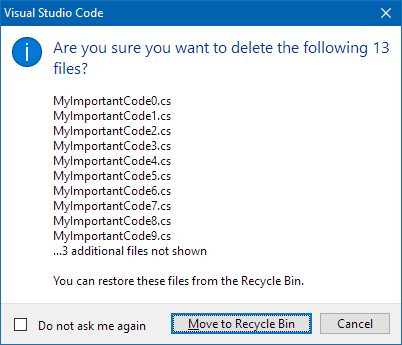
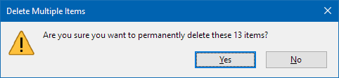
This is far from being perfect. And of course, one could think of a dialog with a scrolling list that allows you to view all files. For certain projects this may important enough to invest the necessary budget. On the other hand, the dialog shown above simply works by concatenating one large string and putting it into a standard dialog. This is a pragmatic solution that does its job well in many cases. Even though you are not told the names of the “3 additional files”, chances are that it is easier for you to remember them by looking at the ten names you can read. This may be less the case as the number of “additional files” grows, but anything is better than just a number like in this dialog.
Confirmation dialogs should contain enough information to work without looking at the rest of the user interface. When you design the dialog, imagine that the user must leave the room for a short moment and comes back to the computer (just a moment, not a lunch break). Make sure he or she can make then an informed decision.
-
Kostenloser Online-Workshop am 4.6.2021: User Interfaces und User Experience für Entwickler (Teil 2)
Am 4. Juni 2021 bin ich ab 20:30 wieder auf dem Twitch-Kanal von Gregor Biswanger zu Gast. Um mehr Zeit für Fragen und Antworten zu haben, hatten Gregor und ich den Workshop am 7. Mai spontan aufgeteilt.
Für diejenigen, die den ersten Teil verpasst haben:
- Gregor hat eine Aufnahme des Streams auf YouTube hochgeladen und mit detaillierten Kapitelmarken versehen.
- Ich werde mit einem groben Schnelldurchlauf starten.
Inhalt
Thema des zweiten Teils sind User Interface Patterns und andere Kochrezepte, die das Design von Bedienoberflächen vereinfachen. Die konkreten UI-Technologien spielen dabei keine Rolle, dementsprechend sind für den Workshop keine technischen Vorkenntnisse notwendig.
Darüber hinaus stelle ich vor, mit welchen Tools und Methoden ich in meinem Alltag Ideen skizziere, GUIs entwerfe und die Abläufe ausprobiere.
Wie beim ersten Mal wird die Interaktion mit Euch eine große Rolle spielen. Habt Ihr Fragen zum Was, Wann und Wie von UI/UX-Design im Umfeld der (agilen) Software-Entwicklung? Habt Ihr Screenshots von GUIs, die Ihr verbessern möchtet? Oder gibt es Designs, die Euch gefallen und die man gemeinsam auf wiederverwendbare Gestaltungsmittel und User Interface Patterns untersuchen könnte? Immer her damit, lasst uns darüber sprechen!
Wie nehme ich teil?
Wenn Ihr nur mal vorbeischauen möchtet, dann ruft am 7. Mai um 20:30 in Eurem Browser einfach https://www.twitch.tv/GregorBiswanger auf.
Um auch am Chat teilnehmen zu können, benötigt Ihr einen (kostenlosen) Twitch Account.
-
Kostenloser Online-Workshop am 7.5.2021: User Interfaces und User Experience für Entwickler
Am 7. Mai 2021 bin ich ab 20:30 auf dem Twitch-Kanal von Gregor Biswanger mit einem Workshop zu UI/UX-Grundlagen zu Gast.
Zielgruppe sind Entwickler und andere Interessierte, die entweder
- in einem Team ohne ein Budget für externe UI-Designer arbeiten, oder
- mit einem besseren Verständnis in die Zusammenarbeit mit Externen gehen möchten.
Inhalt
Nach Grundlagen des Visual Designs stelle ich wichtige UI/UX-Fachbegriffe und -Konzepte in Theorie und Praxis vor, z.B. User Interface Patterns, Empathie, mentale Modelle oder Szenarien. In Live-Demos zeige ich Möglichkeiten zum Skizzieren von User Interfaces.
Der Kanal von Gregor hat eine aktive Chat-Community, dementsprechend interaktiv werde ich den Workshop gestalten. Stellt Eure Fragen im Chat. Vielleicht habt Ihr eine UI, die Ihr gerne verbessern möchtet? Schickt Screenshots und wir wenden das Gelernte direkt live an.
An einem Freitagabend darf natürlich der Spaß nicht fehlen: Problemlösungen à la Indiana Jones, Datenbanken für außerirdische Lebensformen oder Gedanken zum Einfluss von Rallye-Streifen auf die Geschwindigkeit von Sportwagen. Alles frei nach dem Motto “Wenn das Beispiel merkwürdig genug ist, dann ist die Idee dahinter merk-würdig”. Last-but-not-least: Kein UI-Vortrag ohne Beispiele für epische UI-Fails!
Wie nehme ich teil?
Wenn Ihr nur mal vorbeischauen möchtet, dann ruft am 7. Mai um 20:30 in Eurem Browser einfach https://www.twitch.tv/GregorBiswanger auf. Um am Chat teilnehmen zu können, benötigt Ihr einen (kostenlosen) Twitch Account.
-
UI/UX for Devs: An Illustrated Mental Model for Empathy
In a previous blog post I wrote about how mental models help you understand how something works. These models in your mind explain what did happen in the past and provide a reasonable (but not always reliable) prediction for will happen in the future. Interestingly, mental models can do that even though they are simplified, incomplete, and often enough simply wrong.
Empathy also has been a topic on my blog; I wrote about what it is and why it is important and why it is good for you, too.
In this article, I combine the two topics and present you my personal mental model of empathy. Note that it is a mental model, not the mental model for empathy. As such, it is, well… simplified, incomplete, and probably wrong. Still, it is “good enough” for many purposes and hey, it comes with pictures!
To start things off, imagine you have developed a non-trivial application as a single developer.
You, the developer
Here you are, living in your frame of reference, depicted as a nondescript coordinate system:

(I learned at university that axes without units are the worst. Have I told you how mental models are likely to be incomplete?)
Your knowledge about the application
This is what you, the developer, could theoretically know about the application:

You, the user
Now you try to imagine “the user”. Not being the developer of the application, the user is in a different situation:

A first step is trying to put yourself in the other person’s shoes:

The user’s knowledge about the application
You assume that not being the developer means that you cannot have knowledge of the inner workings. As a user, you only have the UI, the manual and other public sources at your disposal for understanding the application. This means that the user inevitably must know less about the software:

Next you are trying to employ some empathy. You think that it is unrealistic that user has read and understood all publicly available information. So most likely the user will know less than theoretically possible:

(Let’s ignore the relative sizes, you get the idea)
But: You are not the user
Always be aware that it is not you, but somebody else in the situation you are looking at:

This person could be highly motivated to use your application. Never underestimate the amount of work people will put into learning something if they feel it enables them to create results that are worth it. Just think how deep some people dig into Adobe After Effects or Microsoft Excel.
But in general, users most likely acquire just enough knowledge to get the job done. This means that they will know next to nothing about some features. At the same time, they can be very proficient in other features if a task at hand demands it.
So the graph depicting the user’s knowledge could look like this, with the sectors standing for parts of the application or large features:

Another user
A different person…

…may use the application for other purposes.
He or she may have more or less experience, in different areas:

A good start, but not quite there, yet
At this point, we have established that you are not the user and that different users have different needs and thus varying levels of knowledge.
But we are still stuck in our own point of view. For instance, we assess the user’s knowledge in terms of the application’s structure as we see it from a developer’s perspective. Even if we consider scenarios during development, we still tend to think in application parts as well as larger or smaller features.
Next: Stop thinking in your frame of reference
The next step is to acknowledge that users have a different frame of reference. As developers, we work on our software for long periods of time, which gives it a high importance in our daily life.
For users, our software is just another application. For them, is is not exactly the center of the universe.
Or, in other words, they live in their own coordinate system:

As an experiment, try to watch yourself how you use and experience the software you did not develop yourself. How different applications, tools and utilities have different importance. And how some software simply does not excite you enough to really learn more than the absolute basics about it.
Now capture that feeling. Be assured, some user out there will feel the same towards your application. A user like this may never become a big fan of your software, but if you design for them, you automatically help everybody else.
If you…
- lead the eye to the right points (by visual design, not a way-too-long onboarding experience)
- write clear UI texts (that even people can understand who do not want to read) and
- design features that are not simply thin UI layers over existing APIs (because users do not think in APIs),
everybody wins.
Using the software vs. getting the job done
Some application features map directly to a user scenario, some scenarios may span multiple features.
But be aware that “real world” scenarios do not necessarily start and finish inside your software. Users may start with ideas, thoughts, purpose, constraints, raw data, etc. outside your application. The work done inside the application may be a first step towards something very different (which means that e.g. a simple CSV export feature can be more important than the fancy result display that you developed). And in between, the scenario may take the users to use other software.
A person in the situation of achieving a specific goal will likely have a different view of the world. To visualize this, think of a coordinate system that looks very different from yours:

Things to remember
- The way you view your application is influenced by your knowledge of application parts and individual features.
Other people may view it in a different way, based on what they see along their path through the user interface. - Assume that people do not actually want to use your software, they want to achieve a specific goal.
If that aligns with your software, good for everybody. - Be aware that even though you and your users have the software as a connection point, your world view may be very different
As a visual reminder, imagine yourself in a cartesian coordinate system and the user in a spherical coordinate system with a different origin. Neither of you lives in the “correct” or “better” coordinate system, they are just different. But the other coordinate system surely does not have your software as the center of the world, that is for sure…
P.S.
If you are interested in a (non-technical) example of completely different coordinate systems, take a look at my post “Exercise in Thinking: Do Racing Stripes Make a Car Go Faster?”.
-
UI/UX for Devs: Have You Thought About the Mental Model?
My day job sometimes involves reviewing existing or planned user interfaces of business applications outside my product team. When I give my feedback to frontend developers, I try to use the opportunity to convey knowledge on UI/UX basics. For instance, by showing them how my findings are informed by a set of questions that can they can use themselves as an early check of their work.
One of these questions is: What is the intended mental model?
I find it helpful because in my experience,
- it highlights problems in a constructive way and
- is a great starter for discussions on working towards a solution.
So, let’s talk about mental models.
What is a mental model?
Generally, a mental model is a simplified, often incomplete (or even wrong) representation of the surrounding world in your mind. The model forms based on the available visible, audible, or sensory information, prior personal experience, what other people have told you or just by guessing.
The benchmark for a mental model is how good it helps you navigate the real world, i.e. if it can explain something that has happened or can offer a reasonable prediction for what will happen.
Take gravity for example. The simple mental model of “things falls down until they get stopped by something” is good enough for most situations in our everyday life.
If a mental model fails to explain an observation (“why doesn’t this ‘balloon’ thing fall down?”) or when additional information becomes available (Helium is lighter than air), the model may evolve, be replaced by another model, or by several models for different situations. But the model(s) remain simple – you usually do not explicitly think about buoyancy if no water is involved, or the gravitational forces that cosmic objects exert on your car.
Example: A mental model for scrolling
Let’s get back to user interfaces. Imagine you have never seen something like scrolling before. Then you watch somebody drag the narrow rectangle at the right side of the window down, causing the larger part to move up:

After you have seen some more scrolling, noticing that content that left the screen can be brought back, the mental model in your head will most likely look like this:

Is this model correct? Do the areas in light gray really exist?
From a purely technical point of view, this is debatable – especially when you think about virtualized scrolling, where the UI “lies” to you, creating the visible part on the fly from pure data (e.g. the text in a text editor).
From a user’s point of view this is not important. The model explains why parts of the screen moved the way they did when you moved the scrollbar. And it allows a reliable prediction what action will bring back content that was moved off the viewport.
In other words: The model is good enough.
Visual cues are key
When a user perceives an application as easy to understand, it means that he/she was able to quickly develop an initial mental model that matches the reality of the user interface. That model surely will continue to grow and evolve and may have to be adjusted over time. But what to look out for are gross misunderstandings, when a wrong mental model leads to confusion, or worse, data loss.
Your job when designing a UI is to “nudge” the user towards a correct mental model. This is a case of “show, don’t tell”: Explaining the basic ideas of the UI in an online manual or a onboarding experience (likely to be skipped) will not reach all users. The UI needs visual cues that convey the mental model that you intended.
For example, when you cannot show all content at once due to space constraints, you somehow must tell the user that there is more content to discover:
- Partially visible content that gets cut off at an edge hints that the area can be scrolled or at least resized.
- Page numbers or simply dots look like paging is possible.
- Stack-like visuals suggest that content can be switched.
Example: A mental model for tabbing
Tab views show different sets of one or more controls in the same space. This user interface pattern is useful if you…
- cannot (or do not want to) show all controls at the same time, but need fast switching and
- you can cluster the controls into groups that make sense.
A mental model for a tab view comes straight from the real world, just imagine e.g. three sheets of paper:

Like other UI elements, the design of tabs has evolved over the years. Moving away from mimicking physical objects and their behavior, the overall trend went to visually reduced designs.
While the following design still tries to convey a foreground-background relationship…

…the second version does not care about how things would work in the real world:

Which is not necessarily a bad thing, to be clear. In UI design, you must deal with the fact that a user has a certain “attention budget”. In your UI, each pixel different from the main background color chips away from that budget. Thus, getting rid of lines, borders and colored area is a good way to reduce “cognitive load” – until it is not. This is the point when you have removed important visual cues that help forming the mental model that you originally intended.
How visual cues influence your mental model
Look at the following four sketches of an application with two levels of navigation:

Notice how the gray backgrounds influence your mental model:
- The upper left does not give you an idea what to expect when you click an item in the top row or one of the icons on the left side.
- The lower right is very clear about the relationships of the different parts of the UI. At the same time, the design is pretty “busy”.
- The upper right and lower left are similar in design but convey different mental models. Which one is “better” depends on factors like scrolling, expected window sizes, etc. So, the answer is the usual “it depends”.
Ask yourself: What is the intended mental model?
The application
Users do not develop a mental model in a vacuum. They look for similarities to other applications. In unfamiliar situations, their behavior is influenced by earlier experiences. While not all applications are the same, certain archetypes have developed over time.
If you aim for a quick route of your users to familiarity with the application, you should be clear about the general model. For instance:
- Is the application a document editor?
Most business users know how to to deal with Office documents. If your application has “things” that can be handled like documents (regardless of whether they are actually stored in files), users can use their previous experience with documents. At the same time, this comes with certain expectations. For example, editing or deleting one “document” should not affect another document (unless there is an explicit relationship). - Is it something that manages one or more lists of “things”, offering views on the data at different detail levels?
This is the model behind applications that have some kind of database at their core. Browsing, searching, or filtering, followed by viewing/editing of single data items are comparable across business applications. Users of your application could e.g. expect that after they have narrowed down the results list, and dive into a single item, that the list will be “somewhere off-screen”. This is an example where a mental model is used for predicting what will happen, i.e. that is possible somehow to come back to the result list. - Is it like a machine that builds something after you have specified what you want to build?
Software that uses the concept of “projects” and “builds” is what developers work with all day. Some single-source documentation systems use the same approach. Another example are e.g. video production tools.
Your application surely can combine different models or be something unique. And if it is similar to existing software, being different can be an advantage. The best thing users can say is “it is like X, but you no longer have to do Y manually”.
What you must avoid is intentionally trying to be similar to other software and then offering a bad experience. For example, early web applications sometimes tried very hard to be like their desktop counterparts before the technology was reliable enough. Which could result in losing work simply by pressing a single key at the wrong time (some may remember: a page-based application, a large text field, some JavaScript that goes wild, lost focus, backspace – everything gone).
The data
Internally, most (.NET) applications deal with objects with properties which in turn can be objects, lists of objects or references to one or more objects. One of the challenges of UI design is to decide how much users should or should not know of these structures.
- Is what a user experiences as a “thing” the same as an object in your code?
Sometimes it is good to hide the complexity of composite objects, sometimes it is not. Take, for example, a form for entering a person’s data. Do you present the address as something that feels like a “thing”, or as something that is part of the person similar to its given and family name? As usual, it depends. On one hand you want a clean and simple UI, on the other hand imagine a database that tracks all addresses that a person has ever lived at. - How do you handle incomplete or invalid “things”?
Let’s say a user has a concept of “things” that map pretty well to objects behind the scenes. Unfortunately, the infrastructure for storing these objects requires them to be complete and valid. Does this impact the user, forcing an “all or nothing” approach when creating a new thing? Or do you allow incomplete data as a “draft”, even if it means it must be stored separately because you e.g. have no influence on the available storage infrastructure?
What to do
- Prepare yourself to be asked “what’s the mental model?”
Even if you will never get asked, this forces you to come up with a short summary that helps you communicating the basic ideas of your application (or a specific part of it). - Remember mental models are simplified and incomplete
When a user writes an email and presses the “send” button, in their mind, this sends the email. Conceptually, emails are moved into the outbox, then collected and sent. But even people who know about this (and may have seen an email stuck in the outbox) tend to think of “click equals send”, because this mental model is – you may have guessed it by now – “good enough”. When you think about mental models in your application, expect users to start with the simplest model they can work with. - Watch yourself how you figure out how other software works
Which visual cues do help you? Where does the software rely on known interaction patterns? Why can you use an application that you have not used before? - Think of instances when your mental model was wrong
Was it your mistake? Did you have assumptions based on prior experience? Was it the application’s fault? What could the software have done differently to prevent this? What about your application? Could this happen to users of your software?
-
A Much Too Short Explanation of UI/UX/Feature/Scenario
This is a side-product of sketches I did for upcoming talks, using an iOS app called Linea Sketch.
User Interface

The user sees a button.
User Experience

How the user feels before, while and after pressing the button.
Feature

What the product does for the user when he/she presses the button.
Scenario

Who encounters what problem and how the product will help him/her on the way to reach their goal.
Oh, the button? You don’t think about the button when first looking at the scenario…that’s the point!
-
Developer Week 2020 verschoben auf November, Online-Konferenz DWX Home als Ersatz
Eigentlich sollte die Developer Week 2020 vom 29. Juni bis 3. Juli 2020 in Nürnberg stattfinden. Ich wäre dort mit meinem Ganztages-Workshop “Von Null auf GUI – Design/UI/UX-Praxiswissen für Entwickler” und einem Vortrag über “User Interface Patterns” vor Ort gewesen – doch dann kam der Virus.
Daraus folgte zum einen eine Verschiebung in den November, und zwar als Hybrid-Modell (sowohl On-Site als auch Remote). Mein Workshop ist jetzt für den 2. November, der Vortrag für den 4. November geplant.
Darüber hinaus wird im ursprünglichen Zeitraum eine reine Online-Konferenz, die DWX Home, stattfinden. Jeweils vormittags gibt es Vorträge zu den Themen DevOps (Montag, 29. Juni 2020), .NET (Dienstag), Testen (Mittwoch), Software-Architektur und -Qualität (Donnerstag) sowie UX und UI Design (Freitag, 3. Juli 2020).
Am UX und UI Design-Tag bin ich mit meinem Vortrag “Fragen, Fragen Fragen…- Diskussionen über UI-Designs” vertreten:
Die richtige Frage zum richtigen Zeitpunkt kann Diskussionen über UI-Designs wertvolle Impulse geben. Dabei muss weder die Frage noch die Antwort besonders weltbewegend sein – ein kleines Stückchen vorher unbekannter Information verändert manchmal massiv den Lauf der Dinge.
In seinem Vortrag vermittelt Roland Weigelt, dass eine analytische Denkweise auch in den vermeintlich eher von Emotionen bestimmten Bereichen Design und User Experience ein wertvolles Werkzeug ist. Und damit es nicht zu trocken wird, geht es nebenbei um Problemlösung à la Indiana Jones, außerirdische Lebensformen und den Einfluss von Rallye-Streifen auf die Geschwindigkeit von Sportwagen.
Für Teilnehmer der Developer Week im November ist der Zugang zur DWX Home automatisch im Ticket-Preise inbegriffen. Für alle anderen gibt es kostengünstige Tagestickets (dafür auf der Ticket-Seite ganz nach unten scrollen).
-
Vortrag bei UXBN am 22. August
Am 22. August halte ich im Rahmen des User Experience Bonn (UXBN) Meetups den folgenden Vortrag:
Fragen, Fragen, Fragen, …
Die richtige Frage zum richtigen Zeitpunkt kann Diskussionen über UI-Designs wertvolle Impulse geben. Dabei muss weder die Frage noch die Antwort besonders weltbewegend sein – ein kleines Stückchen vorher unbekannter Information verändert manchmal massiv den Lauf der Dinge.
In seinem Vortrag vermittelt Roland Weigelt, dass eine analytische Denkweise auch in den vermeintlich eher von Emotionen bestimmten Bereichen Design und User Experience ein wertvolles Werkzeug ist. Und damit es nicht zu trocken wird, geht es nebenbei um Problemlösung à la Indiana Jones, außerirdische Lebensformen und den Einfluss von Rallye-Streifen auf die Geschwindigkeit von Sportwagen.
Die Teilnahme ist kostenlos, wegen der begrenzten Teilnehmerzahl ist allerdings eine Anmeldung erforderlich.
Infos und Anmeldung auf http://uxbn.de/
-
Design/UI/UX-Praxiswissen für Entwickler in Köln und Nürnberg
Am 10. Mai 2019 halte ich auf der dotnet Cologne 2019 einen Vortrag mit dem Namen “Kochrezepte für pragmatisches GUI-Design”.
Am 26. und 27. Juni bin ich in Nürnberg auf der Developer Week 2019. Am 26. Juni ebenfalls mit “Kochrezepte für pragmatisches GUI-Design”, am Tag darauf folgt dann der ganztägige Workshop “Von Null auf GUI – Design/UI/UX-Praxiswissen für Entwickler”.
Abstracts
Kochrezepte für pragmatisches GUI-Design
- Wie entscheidet man, was man sich von anderen GUIs abschauen sollte - und was nicht?
- Wie stellt man Daten in Formularen und Detailansichten geeignet dar, wenn man von der Fachlichkeit eigentlich keine Ahnung hat?
- Wie bändigt man GUIs mit vielen Funktionen?
- Wie sorgt man dafür, dass Anwender sich nicht von der GUI "ausgebremst" fühlen?
Diese und weitere Fragen beantwortet Roland Weigelt in seinem Vortrag. Am Beispiel konkreter Lösungsansätze bietet er einen generellen Einstieg in eine abstrakte und doch praxisorientierte Denkweise in "User Interface Patterns". Roland greift dabei auf seine langjährige Erfahrung in der Produktentwicklung zurück, wo Pragmatismus und Weitsicht gleichermaßen gefragt sind.
Von Null auf GUI – Design/UI/UX-Praxiswissen für Entwickler
Überall dort, wo kein ausgewiesener UI-/UX-Spezialist zur Verfügung steht, ist es umso wichtiger, dass auch Software-Entwickler grundlegende Kenntnisse in diesem Thema haben. Sei es, um die UI einer typischen Business-Anwendung von "schlimm" nach "brauchbar" zu verbessern. Oder auch, um eine informierte Entscheidung treffen zu können, was man sich von anderen UIs abschaut.
In diesem Workshop vermittelt Roland Weigelt Entwicklern ohne jegliche UI/UX-Vorkenntnisse Gestaltungsprinzipien des visuelles Designs, User Experience-Grundlagen sowie das Denken in User Interface Patterns. Und das stets mit einem Blick darauf, was in der Praxis mit begrenztem Budget machbar und tatsächlich hilfreich ist.
Vortragsteile und praktische Übungen wechseln sich ab, um das Erlernte in Einzel- und Gruppenarbeiten direkt vertiefen zu können.
Für diesen Workshop sind von Teilnehmerseite her keine Vorbereitungen notwendig. Einfach hinkommen, zuhören, mitmachen, Spaß haben und viel lernen.
Anmeldung
- dotnet Cologne 2019: Die Anmeldung startet am 20. März um 12:00. Die Kölner Community-Konferenz wird wie in den letzten Jahren wohl wieder in wenigen Minuten ausgebucht sein – kein Wunder bei Preisen von 35,- bis 65,- Euro für Privatpersonen bzw. 139,- Euro für Firmentickets.
- Developer Week 2019: Die Anmeldung ist bereits möglich, bis zum 9. April gelten noch Frühbucherpreise.
-
Looking Back at 2018
The end of the year is typically a time to look back – here’s my personal list of programs and technologies that played an important role for me in 2018.
Visual Studio Code: It keeps getting better and better
This editor-becoming-an-IDE needs no introduction. I have included it in this list because 2018 was the year where I started doing meaningful work beyond editing HTML/[S]CSS files in Visual Studio Code.
For my purposes, it does not replace “classic” Visual Studio, but complements it. It’s not uncommon for me to debug ASP.NET Core and TypeScript code in Visual Studio Code as well as WPF code in Visual Studio 2018 at the same time (in a project where SignalR is used for Desktop Client <-> Server <-> Web Client communication).
I’m extremely impressed by the ecosystem of extensions (e.g. Live Sass Compiler, Live Server) as well as the ongoing development with its monthly releases.
Linea Sketch on iPad Pro: So good, it’s almost worth buying the hardware for
I love Linea Sketch, which is an iPad app for (as the name implies) sketching. When I tried out various graphics applications for my 2018 iPad Pro, I was looking for something that would allow me to quickly draw UI sketches and illustrations for presentations without much overhead. Linea Sketch caught my attention because of the combination of simplicity and power. Two highlight features of the app are “ZipLine” and “ZipShape”, which let you quickly draw straight lines, circles and polygons without breaking your flow of work with the pen.
Take a look at the Linea Sketch website to learn more about this fantastic app.
UWP: I wanted to like it, but what a disappointment…
I already wrote a bit about my frustration with the Universal Windows Platform (UWP) in the introduction to my previous blog post.
Obviously, each new platform comes with a learning curve. If you have a clear vision of what you want to develop and are learning how to do it along the way, you are bound to take longer than expected. What happened with UWP, though, was that I encountered problems that too often became roadblocks for hours or sometimes days. If you get silent crashes or low-level exceptions with an HRESULT that basically says, “something went wrong”, the only thing you can do is to comment out code you have just written up to a point where the program is working again. That reminded me very much of the early Silverlight days (version 2 and 3), Back then, error messages only became helpful in later versions (I remember version 4 and 5 as being good enough).
Web searches showed me that I wasn’t alone. Every so often, a question on a forum would made me go “yeah, I’d like to know an answer to that, too”. Unfortunately, often only reply would clearly indicate that the original post was only scanned for keywords, not actually read, let alone understood. Obviously, this is not a specific UWP problem. It’s just that other technologies seem to have reached a critical mass of users, so that e.g. on StackOverflow, additional comments and answers appear quicker and in larger numbers.
The final straw for me were silent crashes of the Windows App Cert Kit, which had worked on my machine earlier. Searching for a solution, I came across Microsoft forum threads reporting WACK problems that went on for months, with no real solution in sight.
I don’t know whether the WACK problem has been solved now, or whether UWP in general has become friendlier in terms of developer experience. But frankly, I have stopped caring. After all, we’re talking about programming as a hobby. Maybe I’ll revisit UWP in a few years – but for now, I have moved on.
And by the way: I actually do like UWP APIs. They make e.g. creating a thumbnail of a media file or determining the length of a video file super-easy. But I can use these APIs from a WPF program as well, so that’s exactly what I’m doing now.
ASP.NET Core (Web API, SignalR): A positive surprise
While working with UWP was hard work for every step along the path, ASP.NET Core was clearly the opposite experience for me. Whenever I ran into a problem, I found a sample or some forum or StackOverflow post that helped me find a solution. And unlike with UWP, where I came from a WPF and Silverlight background, I didn’t have much prior knowledge.
To put things in perspective:
- I started with version 2.1, i.e. I surely skipped a lot of the problems of the 1.x days.
- I found a great starting point with the SignalR with TypeScript and WebPack sample.
- I use ASP.NET for non-UI, server-related functionality that is limited in scope.
So, your mileage may vary. For me, the positive initial experience was a great motivation to learn more about the platform and to overcome the small problems that are simply a natural part of software development.


