Contents tagged with Style
-
HTML/CSS: How to (Maybe) Prevent the Text of a Time Display from Jiggling Around, Part 2
In my previous blog post, I described how to deal with text output of time codes (e.g., hours:minutes:seconds) in Windows Presentation Foundation (WPF) when using a font where not all digits take up the same space.
This article is a short follow-up on how to solve this issue in HTML/CSS.
What to do in CSS
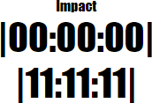
Here is the default behavior for the “Impact” typeface:
After setting
font-variant-numeric: tabular-nums;in CSS, the result is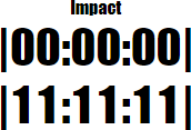
Why the “Maybe” in the title?
Not all fonts actually support the feature; for more information, see the WPF version of the article.
Links
- WPF Article: https://weblogs.asp.net/rweigelt/wpf-how-to-maybe-prevent-the-text-of-a-time-display-from-jiggling-around
- HTML/CSS demo: https://github.com/RWeigelt/CssFontVariantNumeric
- Documentation on mozilla.org: https://developer.mozilla.org/en-US/docs/Web/CSS/font-variant-numeric
-
WPF: How to (Maybe) Prevent the Text of a Time Display from Jiggling Around
Imagine you want to develop a time display that is updated in quick succession, e.g., the timecode during media playback. One unexpected problem that you may run into, depending on the typeface you use, is that the time display shifts to the left or right after updates.
Why you may not notice it at first
When you create a WPF application and do not specify the
FontFamily, text output uses the system font of your operating system. The default is “Segoe UI”, a typeface where all digits take up the same space: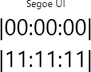
If you change to, e.g., the “Impact” typeface (
FontFamily="Impact"), the digit “1” takes up less space than, e.g., a “0”:
Granted, a time display usually does not jump from “00:00:00” straight to “11:11:11”. But even if just one digit changes, the different width is still noticeable:

For “Impact”, the digits “1” and “7” take up the same space, “2” and “4” are different, and “0”, “3” as well as “5” to “9” have the same width. So from “0” to “5”, the width changes every second, creating the visual effect of the time display “jiggling” left and right.
What to do
The
Typographyclass provides access to various OpenType typography properties. The propertyTypography.NumeralAlignmentis intended to control the alignment of digits (note the choice of the word “intended”, more on that later).If you set
Typography.NumeralAlignment="Tabular"on aTextBlockor aRun, all digits take up the same width:
Note how the glyph of the “1” does not change, it is just laid out differently.
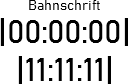
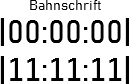
In contrast, the typeface “Bahnschrift” (introduced with Windows 10 version 1704) actually changes the glyph:
Default:
Tabular:
What about the “Maybe” in the title?
Unfortunately, not all fonts support modifying the numeral alignment. Text set in “Arial”, for instance, is not affected by setting
Typography.NumeralAlignment="Tabular":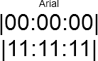
In general, setting the numeral alignment does not hurt, but if you want to be certain, you obviously have to try it out.
Here are the results of testing fonts that come with Windows and that have different widths for digits:
- “Tabular” does work for:
- Candara
- Comic Sans MS
- Constantia
- Corbel
- Impact
- “Tabular” does not work for:
- Arial
- Gabriola
- Georgia
Links
- Code used for creating the screenshots: https://github.com/RWeigelt/WpfNumeralAlignmentDemo
- Microsoft documentation: https://learn.microsoft.com/en-us/dotnet/api/system.windows.documents.typography.numeralalignment
-
The Search for a Proportional Font for Developers (Revisited for VS Code)
Back in 2016, in my article “The Search for a Proportional Font for Developers”, I wrote about trying out various fonts as a replacement for Segoe UI, a sans-serif font which once had, but then lost serifs for the uppercase “i”. In the end I settled on Ebrima, which (according to Wikipedia) “is an OpenType font designed to support African writing systems.” And: “Its Latin alphabet is based on the Segoe font.” The design of the Latin alphabet is based on the Segoe UI font from before Windows 8, i.e., it still has the serifs for the uppercase “i”.
There is an issue, though: The backtick character in Ebrima has a special behavior that most likely has its roots in the original purpose of the font but does not work well for displaying source code. Which turned out to be a problem when I started to work more with TypeScript/JavaScript in addition to my usual C# development.
Look at this example, first shown using the Consolas font:
(The font size is larger than usual for demonstration purposes)
And now in Ebrima:
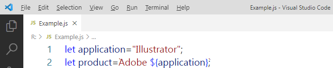
Note that the backticks are barely visible.
Here is the example in Segoe UI:

The backticks are now visible, but uppercase “i” and lowercase “L” are hard to distinguish (even more so at my usual font size).
Stylistic sets to the rescue
When Segoe UI was updated for Windows 8, the original designs of the modified glyphs were moved to the SS01 OpenType stylistic set instead of removing them altogether. Which means that they can be brought back – if you know how.
The “regular” Visual Studio does not let you activate stylistic sets (not exactly a surprise, we cannot even have italics in the editor out-of-the-box). But Visual Studio Code does.
In the font settings UI, under “Font Ligatures”, press the “Edit in settings.json” link:
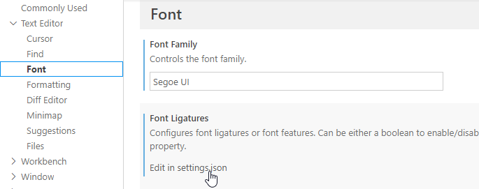
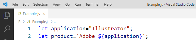
Next, add the following setting for
editor.fontLigatures(note the double and single quotes):{ ...
"editor.fontLigatures": "'ss01'", ... }This is the result:

Nice!
Now if only the WPF-based, “big” Visual Studio (which I use for my C# development) would be a bit more flexible when it comes to fonts…
-
WPF, Text Rendering and the Blues
I am currently working on a small webcam utility written in C#/WPF that I intend to release as freeware later this year.
On the main window, I use a
ComboBoxfor selecting a webcam in a dropdown list, with the toggle button of the control styled to look like a heading:
When you move the mouse pointer over the toggle button, the text and the glyph turn blue – nothing special.

The application does not have a main menu, only a settings menu that you open by clicking a gear icon:

The icon also turns blue when the pointer hovers over the general area:

But wait a second… is this the same blue? A quick check:
- The XAML says the text color is
#0987c3. - The color picker in Photoshop tells me that the color of most icon pixels is… also
#0987c3!
What is going on?
On a screenshot zoomed to 300%, the gear icon looks like this:

And this is the text at 300% size:

The colored pixels to the left and the right of the characters are caused by ClearType. You will also notice that many pixels “inside” the character shapes also have a different color. This is because less pixels than one might expect are fully covered in blue – which means that more pixels have their color modified by ClearType.
What did I do wrong?
It is not what I did do, but what I did not do. I did not tweak WPF’s text rendering to suit my needs. Which sounds curious, because writing a desktop application that looks good at typical application font sizes is not exactly an exotic usage scenario.
When WPF was developed, it was designed to be device-independent and ready for a future of high pixel density displays (“HiDPI”). So WPF rendered text exactly as specified by the font metrics, which on normal density displays led to blurry characters. It took until .NET 4 for WPF to offer a way to render small text with an emphasis on readability instead of correctness (read this old article by Scott Hanselman for a look way back in time).
What to do
As a WPF developer, you can influence the text rendering by using the attached properties
TextOptions.TextFormattingModeandTextOptions.TextRenderingMode. You apply them directly on an element, e.g., aTextBlockor set them on a window.TextOptions.TextFormattingMode
The property
TextOptions.TextFormattingModecan be set toDisplayorIdeal(which is the default).- With
Ideal, text is rendered according to the font's metrics. Which is fine for large text, but not so much for small text on a non-HiDPI display. - With
Display, the text rendering favors of aligning letters to pixels. This is especially important for small text on normal density screens.
TextOptions.TextRenderingMode
The property
TextOptions.TextRenderingModecontrols the way rendered text will be anti-aliased. Possible values areAliased(which we will see can be confusing),Auto(the default),ClearType, andGrayscale.To show off the possible combinations, I placed the gear icon directly in front of the text (where it does not make any sense, just for comparing colors):
DisplayAliased

DisplayAuto

DisplayClearType

DisplayGrayscale

IdealAliased

IdealAuto

IdealClearType

IdealGrayscale

So many options…
In a first round, I eliminated:
Display&Aliased(no anti-aliasing),Ideal&ClearType(the combination that caused me to write this article in the first place),Ideal&Auto(which in my simple scenario looks the same asIdeal&ClearType), andDisplay&ClearType(even though it looks better thanIdeal&ClearType)
Which left me with the following options:
DisplayGrayscaleIdealAliasedIdealGrayscaleIn the end, I decided to use
Ideal&Aliasedbecause I wanted the bolder text without a larger font size. And Segoe UI in “real” bold does not look good at this font size. Interesting that withIdeal, the settingAliasedis actually anti-aliased…I set
TextOptions.TextFormattingMode="Display"on my application window but did not specifyTextOptions.TextRenderingModethere.For the dropdown list, I set
TextOptions.TextFormattingMode="Ideal"andTextOptions.TextRenderingMode="Aliased"on theContentPresenterof the toggle button.A note on “Display” vs. “Ideal” used with “Grayscale”
While writing this blog post, I had to juggle a larger number of image files than usual. When I saw the letter “P” in the enlarged versions of
Display&GrayscaleandIdeal&Grayscale, I first suspected I had mixed up the screenshots. But that was not the case; it is just a coincidence that the “H” and the “P” look sharper.This becomes clear when you look at a different text:
DisplayGrayscale

IdealGrayscale

Note the way the “m” is rendered and how more vertical lines are aligned to full pixels in
Displaymode.A good example for small sample sizes leading to wrong conclusions…
- The XAML says the text color is
-
Quick #if … #endif in Visual Studio
In my previous blog post “Commenting out Code in C# (Oldie but Goldie Tip)” I recommended using “#if … #endif” to disable code lines.
A quick way to do this in Visual Studio:
- Select the code lines you want to disable.
- Hit Ctrl+K, Ctrl+S to open the following popup:

- Press the Down Arrow key, then Enter.
- Enter an undefined symbol name (e.g. DISABLED). Note: the default is “true”, which is defined and thus does not disable the code).
-
Commenting out Code in C# (Oldie but Goldie Tip)
I usually “comment out” code
- when something does not work as expected and I am looking for a workaround, or
- when I want to quickly try out an idea for an alternative solution
and
- I feel that using source control is too much hassle for what I’m trying to do in this situation.
How?
The term “comment out” obviously comes from using code comments to hide source code from the compiler. C# has two kinds of comments that can be used for this, each with their pros and cons:
- End-of-line comments (“// this is a comment”) can be nested, i.e. you can comment a commented line. But they do not explicitly convey the start and the end of a commented section when looking at adjacent commented lines.
- Block comments (“/* this is a comment, possibly spanning several lines */”) do have an explicit start and end, but cannot be nested; you cannot surround a block comment with a block comment.
For disabling full lines of code, a different approach is to use the “#if … #endif” directive which tells the C# compiler to consider the code inside only if the specified symbol is defined. So to disable code, you simply specify a symbol that does not exist:
#if SOME_UNDEFINED_SYMBOL
	...one or more lines...
#endif
Using the preprocessor for this purpose is nothing new, especially to those with a C/C++ background. On the other hand, considering how often I watch developers use comments in situations where “#if” would have clear advantages, maybe this blog post benefits at least some people out there.
Why #if?
“#if” directives can be nested
The C# compiler does not blindly look for a closing “#endif”; it understands which “#endif” belongs to which “#if”, so e.g. the following is possible:
#if DISABLED
	...some code...
#if DEBUG
	...debug code...
#endif
	...some code...
#endif
You can express why you disabled a specific block of code
For example, you could use “#if TODO” when you are working on new code, but want to quickly run the program again without that code before continuing.
Something like “#if TO_BE_DELETED” (or maybe “#if DEL” for less typing) could mark code that you intend to remove after compiling the project and running the unit tests. If you are consistent with the naming of the symbol, performing a cleanup across the project is easy, because searching for “#if SYMBOL“ works well.
Obviously, you could choose more descriptive symbols (e.g. “#if TODO_DATA_ACCESS” and “#if TODO_CACHING") to differentiate different places of ongoing work. But if you think you need this, it could be a sign you are trying to juggle too many balls at once.
“#else” is great while you work on replacing code
Sometimes, when I have to deal with a non-obvious or even buggy third-party API, writing code involves a lot of experimentation. Then I like to keep old code around as a reference for a moment:
#if OLD_WORKAROUND
	...old code...
#else
	...new code...
#endif
You can easily toggle code on/off
You can enable the disabled code simply by defining the symbol, either using “#define” in the same source file or as a conditional compilation symbol for the whole project.
Alternatively, you can invert the condition for a specific “#if” with a “!” in front of the symbol:
#if !DISABLED
	...some code...
#endif
Being able to quickly switch code off and back on, or – in conjunction with “#else” – to switch between old and new code without losing the exact start and end positions of the code blocks is a huge plus. I use this e.g. when working on interactions in GUIs where I have to decide whether the old or the new code makes the user interface “feel” better.
Notes on disabled code
- Disabled code in a code base should always be viewed as a temporary measure, because code that never gets compiled “rots” over time. To the compiler/IDE, disabled code is plain text that is not affected by refactoring or renaming, i.e. at some point it is no longer valid.
- Try to get rid of disabled code as soon as possible, preferably before committing to source control.
- Last, but not least: Consider using source control for what it is good at - it exists for a reason. For instance, when experiments involve changes to many files, a new branch may be the better choice.
-
Speakers, Check Your Visual Studio Code Theme!
tl;dr: If you use Visual Studio Code in your talk, please do the audience a favor, press Ctrl+K, Ctrl-T and choose the theme that best fits the lighting situation, not your personal taste.
Some people like “dark” UI color schemes, i.e. dark background with light text and icons. Others prefer black text on light background. Visual Studio 2019 comes with a light theme by default, Visual Studio Code with a dark theme. So, what is better?
As long you are on your own at work or at home, the answer is “whatever gives you the best experience”.
But as soon as you speak at a conference or a user group meetup, or maybe just in front of your colleagues, it’s no longer about you. It’s about what is best for your audience.
Source code is different from slides
When you are showing source code in a talk, you must find a compromise between the font size and the amount of text that is visible without too much horizontal scrolling. The result is usually a font size that is smaller than what you would use on a PowerPoint slide. That means that each character consists of far less pixels that either lighten or darken the screen. Which would not a problem per se, if we only had to care about the legibility of white text on dark background or black text on light background.
But source code is usually shown with syntax highlighting, i.e. as text that switches between a variety of colors. Because not all colors have an equal brightness, some parts of the source code can be much harder to read than other. This is especially true with dark themes, when the “dark” background does not appear as dark in the projection as intended, because of a weak projector and/or a bright room. The weaker contrast appears even worse when the colored text stands between white text – exactly the situation with syntax highlighting.
Care about legibility first
Proponents of dark themes cite the reduced eye strain when using a dark background. And they are right, staring at a bright screen in a dark room for a long time can be painful. On the other hand, first make sure the audience members in the back do not have to look twice because parts of the source code are hard to read.
Personally, in all the sessions I attended, I had more problems reading source code on dark-themed IDEs than I suffered from eye strain. Your experience may be different, of course.
Don’t theorize, test
When you set up your computer in the session room before the talk, not only check the font size, but also how well both dark and light themes are readable.
Fortunately, you can switch Visual Studio Code’s color scheme quickly. So, before your talk
- press Ctrl+K, Ctrl+T (or choose File > Preferences > Color Theme in the main menu)
- use the up/down cursor keys to select a theme (e.g. “Light+” or “Dark+”, Code’s default)
- and press Enter to use the theme.
Walk to the back of the room and look for yourself. And… be honest.
It’s not about “it ain’t that bad”
When you test your favorite theme in the room, don’t go for “it’s good enough” just because you like that theme. Switch to a different theme and make an honest assessment: Is “your” theme really better in this room, for this lighting situation? If not, choose another theme.
Thank you!
-
The Search for a Proportional Font for Developers
Text editors and IDEs usually use monospaced, i.e. non-proportional, fonts by default. This may seem like an obvious choice – after all, how else do you line up characters horizontally?
The disadvantage of a monospaced font is that text lines can become relatively wide, because by definition, all characters have to have the same width as the character that requires the most space (the uppercase “W”).

Back in the 80ies and early 90ies, with identifier names like “strnicmp()”, this wasn’t much of an issue. But then libraries grew and identifier names got longer and longer. At the same time, in my IDE the source code editor on one hand and an increasing number of additional panes on the other hand were competing for screen space. In the editor, I usually had a ton of unused whitespace behind short text lines, but when a line contained a slightly longer identifier, it often got clipped.
That was the point when I asked myself how important exact horizontal alignment of characters was to me. Less horizontal scrolling and better readability for long names in return for giving up full control looked like deal good enough to give proportional fonts a try.
The Switch
I don’t quite remember the exact time when I switched; the blog post ”My Transition from Fixed to Proportional Width Fonts for Editing Source Code” is from 2004, years after the fact.
What I do remember, though, is that it was the Verdana font that made the switch final. Verdana is a sans-serif font, except for serifs for the uppercase “I” to make it easily distinguishable from the lowercase “L”.
Here’s a (wildly exaggerated) code example to demonstrate why this is important, first in Arial:

…and here in Verdana:

In Arial’s defense, I must say that I like Arial’s bold text much better than Verdana’s. And, for my personal taste, Verdana is a bit too wide (especially at larger font sizes).
Its cousin Tahoma, on the other hand, is slightly too narrow:

In the end I learned to live with Verdana, but when Segoe UI was introduced along Windows Vista, I switched immediately:

Like Verdana and Tahoma, the bold version of Segoe UI is pretty thick, but I like keywords and class names being shown in bold (even if it’s too heavy).
Noooooo…!
After I upgraded my computer from Windows 7 to Windows 10 (I skipped Windows 8.x), I noticed Segoe UI had changed. The most dramatic change: The uppercase “I” lost its serifs (see: Segoe UI gets a subtle facelift in Windows 8)!
Which means that the code example now looks like a soup of vertical bars:

Searching for Alternatives
With Segoe UI no longer suitable for source code and going back to Verdana not exactly an attractive option, I searched the web for alternatives. So far, I’ve come across the following fonts (in no particular order):
Clear Sans
(Intel, https://01.org/clear-sans)

Clear Sans doesn’t seem to be hinted well enough for rendering at 10pt on a screen at around 96 pixel per inch, at least with ClearType on Windows (I don’t have a Mac for comparison). While it looks rather ugly on my machine, Clear Sans turns out pretty nice at 20pt or when I scale Visual Studio’s editor to 200%, so it may be a good choice for users with a HiDPI display.
Source Sans Pro
(Adobe, https://github.com/adobe-fonts/source-sans-pro)

What I wrote about Clear Sans in regard to hinting is also valid for Source Sans Pro. For my personal taste, though, the difference between the uppercase “I” (without serifs) and the lowercase “L” (with only a small tail at the bottom) is too subtle, regardless of font size.
PT Sans
(ParaType, http://www.paratype.com/public/)

PT Sans Caption has serifs for the uppercase “I” and a tail at the bottom of the lowercase “L”, which is a bit too much in my opinion – and doesn’t look any better at larger sizes.
Input Sans
(Font Bureau, http://input.fontbureau.com)
Input is not a single font, but a whole family of both monospaced and proportional fonts and font variants. Selecting your favorite is easy, using a nice configuration tool (http://input.fontbureau.com/preview).

I played around with the configuration utility for a long time, but I couldn’t get any results that were pleasant to my eyes. At larger font sizes you can see that a lot of thought about maximum readability of individual characters went into the design. But I don’t need a font for labeling the controls of a nuclear power plant, I need a font that doesn’t hurt my reading flow – in that regard, Input Sans just doesn’t work for me.
An Unexpected Discovery: Ebrima
In a typical case of “why didn’t I do that earlier?”, I copied some source code into Microsoft Word and tried all the fonts I had on my computer using the font live preview (selecting all text and moving through the font list with the down arrow key). That’s how I came across Ebrima… and it looked just like the old Segoe UI:

But why is that? And where did it come from? From the Wikipedia entry: “Ebrima is an OpenType font designed to support African writing systems. It [...] is part of the Windows 7 operating system. [...] Its Latin alphabet is based on the Segoe font”.
I have Ebrima on my machine because I did an upgrade installation from Windows 7 to Windows 10 and I can use it because I don’t need the more special Unicode characters. Lucky me!
Where from here?
So for now, I finally have a font for Visual Studio. As I mentioned, the bold text is a bit too heavy, but you can’t always have it all. At some point in the future I surely will have a HiDPI display, then I may give Clear Sans another chance.
What about you? Have you found your “perfect” proportional font yet?
-
programmingfonts.org – THE Resource for Monospace Fonts
While preparing an upcoming blog post about proportional fonts for programmers, I came across a tweet by Val Head (@vlh), pointing me to programmingfonts.org. The website boasts the slogan “The most complete resource for monospace fonts on the web” and looking at the list of fonts, I’m inclined to believe it.
I browsed the site for a while until finally saw the link “Try them all online right now” which was hidden in plain sight directly in front of me:

The link opens a nice web application that lets you test drive a huge number of fonts, using a text of your choice. The available themes are a matter of personal taste, but this is mainly about getting an idea whether a font looks good before spending more time on it.

-
Live Coding in Presentations – Don’t Waste my Time!
Over the years I have grown very sceptical of the “fewer slides, more demos” kind of presentations. I simply have seen too many presentations where things went downhill from the moment the speaker opened Visual Studio.
In an internal presentation or at a user group meeting this is “unfortunate”. But if I fly halfway around the globe and then have to sit through such a talk, I might get a little upset (MIX11 WP7 boot camp, I’m looking at you).
Dear speakers, if you plan to give a talk that contains any kind of “live” usage of Visual Studio, I kindly ask you to keep a few things in mind.
First of all: Even though we developers work with Visual Studio every day, you have to be fully aware that using Visual Studio in front of an audience poses a significant risk:
- Every bit of mistyping or misclicking is a distraction on the way from what you just said to what you wanted to show.
- At some point, Visual Studio will make you and the audience wait for something to complete.
- Visual Studio or some other technology may decide to stop working at the worst possible moment. In contrast, I cannot remember a crash of PowerPoint in any talk I’ve ever seen.
- When writing code you may make mistakes that result in build errors – another distraction that disturbs the flow of your explanations.
It is your job to minimize these risks. Everything that doesn’t work as expected is wasting the audience’s time. If you manage to recover quickly from problems, good for you. But solving an unexpected problem in a demo remains a distraction unless you specifically planned to show the solution to that problem.
Also be aware that what you see differs significantly from what the audience sees. You may see the five important lines of code or the three files that were just added to the project. The audience sees an IDE with lots of panes covering the whole screen, interesting menu and toolbar items from plugins, the full project structure inside the Solution Explorer, and lots of source code besides the few lines you are currently talking about.
Note that even with all these problems, I’m not advocating “all-slides” talks for programming topics. I have seen quite a few talks with a very effective usage of Visual Studio. All these had in common that the speakers had a good idea of when to use Visual Studio and when to rely on prepared slides.
What exactly are you trying to show inside Visual Studio?
- The “discoverability” of an API by showing Intellisense on it: Great!
- The values of some object properties at specifc breakpoints in a debugging session: Great!
- How easy it is to build something within minutes: Ok, but think about choosing a staggered approach of first coding some parts manually, then using code snippets to avoid repetitions, later maybe even using prepared code files if the audience can imagine they contain “more of the same”.
Note that you start losing parts of your audience if you have to scroll a lot; some people may tune out and simply wait for you to hit F5. - Some files that were generated: If you’re already inside Visual Studio, just want to show that they were generated and will move on after a brief glance at their content (“see: here’s XML and here’s C# code”): OK.
If you have to explain their exact purpose and their relationsships, think about preparing slides. A screenshot of (a part of) the Solution Explorer not only helps to focus on the files, it also allows you to highlight them and add call-outs that support what you are saying. - Features of the Visual Studio UI like dialogs, customization options, etc.: If you have to switch to Visual Studio just for that, better use one or more screenshots. Highlight important details and/or add call-outs.
- Some code that is already complete: It depends. What part should the audience actually remember? Would it be possible to put that code on a slide? If there’s a chance, use the slides. And again: focus of attention, highlighting of important parts, call-outs for explanations.
If you have to show the code inside Visual Studio, practice finding the locations instantly. Don’t stumble through file after file on stage just to notice you’re in the wrong project.
Each of your demos can be split into the following parts; think about where and how you deal with them:
- Preparation – you have to set up the environment before (the key part of) the demo can be started.
- Establishing context – you have to give the audience enough information to understand what you will show them.
- Show – demonstrate what the audience should see happen live.
- Summary – explain what the audience just saw.
- Conclusion – explain what the main takeaways are.
In all really good presentations that I have seen, little or no preparation was visible to the audience (i.e. all required projects were loaded before the talk started), unless it was actually part of the demo. And the speakers used slides during the “context”, “summary” and “conclusion” phases (instead of having the IDE open and just talking), which kept them focussed.
But this sounds like a lot of work?!
Because it is. Good presentations are a lot of work. Regardless of whether you are using slides or Visual Studio. Just look at e.g. the live coding by Scott Hanselman during the MIX11 keynote. Don’t think for a second that he did this without lots of preparation and practice.
Whenever you enter the stage at a conference, I expect that you are highly prepared and invested a lot of time into your presentation, period. Otherwise you’re wasting my time – with or without live coding.


