Contents tagged with VS Code
-
The Search for a Proportional Font for Developers (Revisited for VS Code)
Back in 2016, in my article “The Search for a Proportional Font for Developers”, I wrote about trying out various fonts as a replacement for Segoe UI, a sans-serif font which once had, but then lost serifs for the uppercase “i”. In the end I settled on Ebrima, which (according to Wikipedia) “is an OpenType font designed to support African writing systems.” And: “Its Latin alphabet is based on the Segoe font.” The design of the Latin alphabet is based on the Segoe UI font from before Windows 8, i.e., it still has the serifs for the uppercase “i”.
There is an issue, though: The backtick character in Ebrima has a special behavior that most likely has its roots in the original purpose of the font but does not work well for displaying source code. Which turned out to be a problem when I started to work more with TypeScript/JavaScript in addition to my usual C# development.
Look at this example, first shown using the Consolas font:
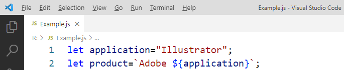
(The font size is larger than usual for demonstration purposes)
And now in Ebrima:
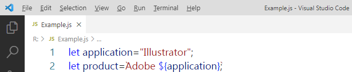
Note that the backticks are barely visible.
Here is the example in Segoe UI:

The backticks are now visible, but uppercase “i” and lowercase “L” are hard to distinguish (even more so at my usual font size).
Stylistic sets to the rescue
When Segoe UI was updated for Windows 8, the original designs of the modified glyphs were moved to the SS01 OpenType stylistic set instead of removing them altogether. Which means that they can be brought back – if you know how.
The “regular” Visual Studio does not let you activate stylistic sets (not exactly a surprise, we cannot even have italics in the editor out-of-the-box). But Visual Studio Code does.
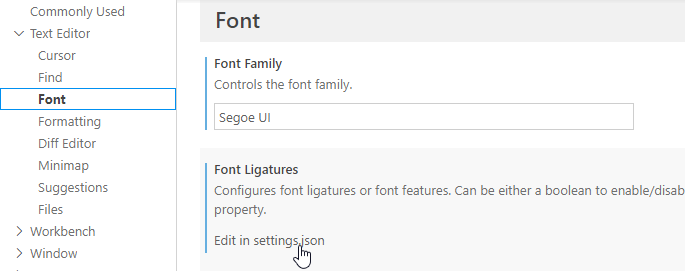
In the font settings UI, under “Font Ligatures”, press the “Edit in settings.json” link:
Next, add the following setting for
editor.fontLigatures(note the double and single quotes):{ ...
"editor.fontLigatures": "'ss01'", ... }This is the result:

Nice!
Now if only the WPF-based, “big” Visual Studio (which I use for my C# development) would be a bit more flexible when it comes to fonts…
-
Emaroo 4.9.0 - Support for Visual Studio Code 1.64
Emaroo is a free utility for browsing most recently used (MRU) file lists of programs like Visual Studio, VS Code, Word, Excel, PowerPoint, Photoshop, Illustrator and more. Quickly open files, jump to their folder in Windows Explorer, copy them (and their path) to the clipboard - or run your own tools on files and folders with custom actions!
- Download Emaroo on www.roland-weigelt.de/emaroo
About this Release
- Updated: Support for Visual Studio Code 1.64 (changes regarding most recently used folders/workspaces). Previous versions of Visual Studio Code are still supported.
-
Speakers, Check Your Visual Studio Code Theme!
tl;dr: If you use Visual Studio Code in your talk, please do the audience a favor, press Ctrl+K, Ctrl-T and choose the theme that best fits the lighting situation, not your personal taste.
Some people like “dark” UI color schemes, i.e. dark background with light text and icons. Others prefer black text on light background. Visual Studio 2019 comes with a light theme by default, Visual Studio Code with a dark theme. So, what is better?
As long you are on your own at work or at home, the answer is “whatever gives you the best experience”.
But as soon as you speak at a conference or a user group meetup, or maybe just in front of your colleagues, it’s no longer about you. It’s about what is best for your audience.
Source code is different from slides
When you are showing source code in a talk, you must find a compromise between the font size and the amount of text that is visible without too much horizontal scrolling. The result is usually a font size that is smaller than what you would use on a PowerPoint slide. That means that each character consists of far less pixels that either lighten or darken the screen. Which would not a problem per se, if we only had to care about the legibility of white text on dark background or black text on light background.
But source code is usually shown with syntax highlighting, i.e. as text that switches between a variety of colors. Because not all colors have an equal brightness, some parts of the source code can be much harder to read than other. This is especially true with dark themes, when the “dark” background does not appear as dark in the projection as intended, because of a weak projector and/or a bright room. The weaker contrast appears even worse when the colored text stands between white text – exactly the situation with syntax highlighting.
Care about legibility first
Proponents of dark themes cite the reduced eye strain when using a dark background. And they are right, staring at a bright screen in a dark room for a long time can be painful. On the other hand, first make sure the audience members in the back do not have to look twice because parts of the source code are hard to read.
Personally, in all the sessions I attended, I had more problems reading source code on dark-themed IDEs than I suffered from eye strain. Your experience may be different, of course.
Don’t theorize, test
When you set up your computer in the session room before the talk, not only check the font size, but also how well both dark and light themes are readable.
Fortunately, you can switch Visual Studio Code’s color scheme quickly. So, before your talk
- press Ctrl+K, Ctrl+T (or choose File > Preferences > Color Theme in the main menu)
- use the up/down cursor keys to select a theme (e.g. “Light+” or “Dark+”, Code’s default)
- and press Enter to use the theme.
Walk to the back of the room and look for yourself. And… be honest.
It’s not about “it ain’t that bad”
When you test your favorite theme in the room, don’t go for “it’s good enough” just because you like that theme. Switch to a different theme and make an honest assessment: Is “your” theme really better in this room, for this lighting situation? If not, choose another theme.
Thank you!